In what way does your media product use, develop or challenge forms and conventions of real media products.?
In our Horror trailer we use many typical horror conventions and we also challenge the stereotypical forms with new and exciting ideas.
|
Using Conventions
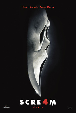
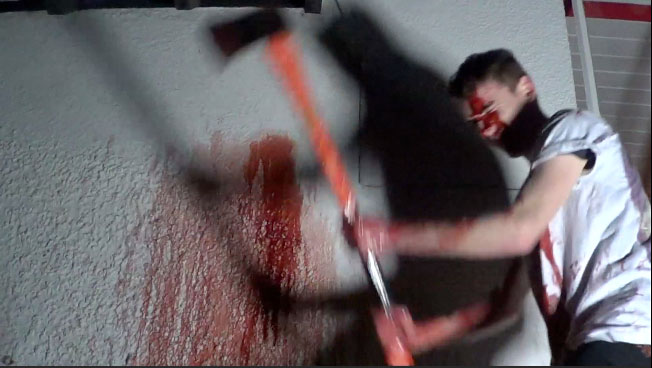
1. The Knife Our first convention is the classic knife that is so often seen in horror films. We have put dripping blood onto the knife to add to the horror effect. We have shown that in the film Scream there is also a knife as quite a the conventional icon. Knifes are often used in horrors as the murder weapon as they can be the most gruesome ways for a death rather than a gunshot that can often be instant and therefore a lot less painful. The knife in Scream is their main icon and they have therefore used this in their poster for Scream 4 2011, we took much influence from this and decided to use the knife for our poster as well. |
|
|
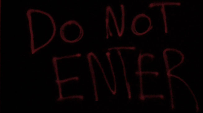
2. 'DO NOT ENTER' sign
We decided to put this 'DO NOT ENTER' sign as we thought that it is very familiar within the horror industry. It is a sign indicating that it is a place that the victims should not be going, however they are usually ignorant of the sign and decide to go into the forbidden area anyway. 3. Final Scare In the scene right at the end of our trailer just before the ending titles we have the final scare with the drawing back of the shower curtain. Its very common for horror trailers to have a final scare as it is the last part that the audience will see and therefore they will want to have a lasting impression put on them. Scaring them right at the end indicates that the film will scare them a lot and this is a reason in why they would want to come and watch the film. |
|
Developing Conventions
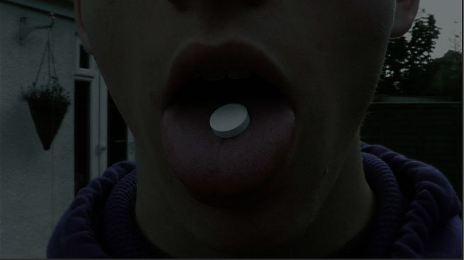
1. Drugs We used the original convention of 'when people do bad things, bad things will happen to them' in a horror movie. This is shown in our horror trailer when one of our characters is smoking and drinking alcohol just before they are killed off by the murderer. However, we decided to try and develop this concept further by introducing a more modern twist to it. We used a new experimental drug that has huge side effects. This is therefore the 'bad thing' that they have done and the reason that they are going to die. |
|
|
Challenging Conventions
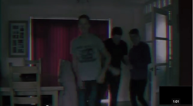
1. The Lads We have decided to only use four guys for the main characters of the trailer. This is a direct challenge to any theory that you have to have members of both sex in a horror film. We feel that even though we haven't used a female in our trailer we would be able to attract an audience of both sexes. Females would want to come and watch the film possibly for the sex appeal of the male protagonists, whilst males will come to feel proud of their sex and to relate with the characters and heroes. |
|
2. Friends Killing their friends
Due to the affect of the drugs we have friends killing their own friends in our movie this is put across in the trailer as the lad that has taken drugs kills the lad smoking and drinking. It is very rare to have a commonly know killer as many theorist believe the unknown is more terrifying in horror, however we have decided to challenge this theory. We feel that knowing who the person is and how they have changed is just as scary as the victim will not want to defend themselves by killing their friend, therefore leaving themselves defenceless. |
|
|
Poster
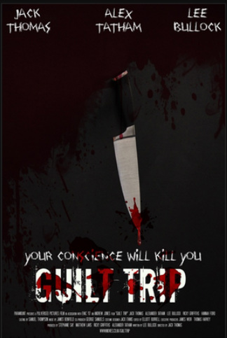
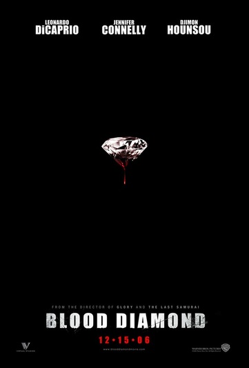
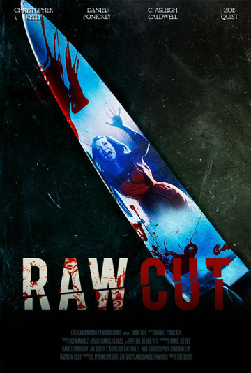
Our poster has taken some inspiration from a few other posters so that it could follow some of the conventions associated with a horror poster. One such poster is Blood Diamond 2006 poster. It has the same black background effect with blood dripping from an item. Also the Scream 4 2011 poster has the knife effect that we have paid homage to. A knife is quite a regular feature in horror films and many posters are therefore recognised as a horror by having a knife on them. This Raw Cut 2013 poster has the knife as the main focus point with the female victim inside it as if it were the reflection. Blood as well is very conventional to a horror film and is often, nearly always, used in horror posters so that the audience is clear on the genre of film. The slogan adds the little more identity to the poster so that people can know the films icons. |
|
|
|
Magazine Front Cover
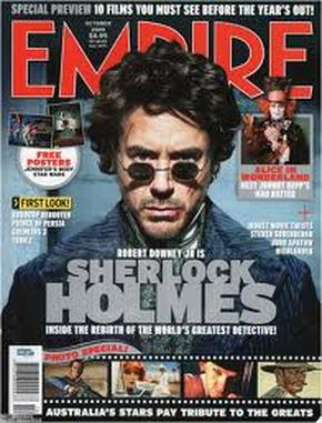
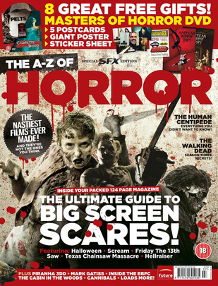
The Magazine front cover follows some conventions of typical magazines. However, it is quite rare to have a whole magazine based on horror therefore this is actually a development of convention. Empire magazine seen below is a very popular film magazine. It has a bold red title and we took inspiration from this, as well as the fact that its the colour of blood. We have chosen to use the face split into a normal and possessed side to demonstrate the change that the character goes through. We feel its obvious enough for the audience to distinguish the difference yet subtle enough for it to blend well and look aesthetically pleasing. The film roll at the bottom of ours is also an inspiration we took from some magazines such as the sample Empire one. It is not often on the front cover of magazines yet we feel it is stylish and relevant. The Horror magazine below is a rare horror magazine and clearly shows its genre from the cover. Blood is a key feature and therefore we have added some onto ours. Slogans at the top and writing down the side is a typical convention of magazine front covers and we have not strayed too far from these conventions. |
|
|
