|
|
This is our old Production Company that we had made ourselves on Final Cut Pro. We combined a computer animated design with text from Live Type and a sound that we downloaded from iTunes. Using these separate items, we edited them together so that they fitted suitably. We called it Pulverised Pictures due to the slamming of the gate which could represent the word 'Pulverised'. The sound is used so that there is a sort of banging sound when the gate crushes and meets in the middle to add to the effect of how heavy the gate seems. We firstly wanted to make it so that the text was there to begin with but was then crushed by the gate. However, with the technology available to us and what we had to work with, we were unable to achieve what we exactly wanted so we changed it to what you see here and we feel it still works very well. JT
|
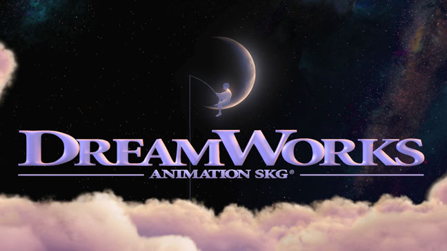
'DreamWorks' are a Production company that helped co-produce 'Saving Private Ryan', 'Minority Report' and 'Small Soldiers'. They also produced 'Anchor Man- The Legend Continues'. The style of the production company is also similar to that of the Distribution company as it is in the clouds. The boy fishing on the moon is also an iconic image now as the production company has became so famous. AT
|
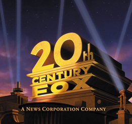
"20th century fox" are a production company which help to produce many blockbuster films such as the star wars trilogy which were a massive hit. but more recently they helped to produce "avatar" which was the biggest blockbuster movie of ever and it made the most money. "20th Century fox" is obviously a very big production company and it has now also became an iconic movie image. When we make our production company we will try to make a memorable image so it stays with the audiences mind and they remember what it was. RG
|
|
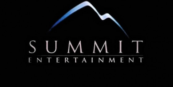
This is "summit entertainment" production company which helped to co produce the "Wrong turn" series and this is what we took inspiration from for our trailer as we paid homage to some ideas from "Wrong turn 4 bloody beginnings". The black background is very effective in this image as it emphasises that the production company is producing a horror movie. The white writing in this production company stands out and it makes the image look interesting and more professional. We will try and make our production company look like it is producing a horror so we will take inspiration from "summit entertainment". LB
|
|
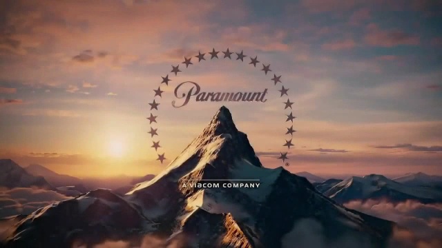
A more recent horror film that was produced "WWZ" was helped produced by "Paramount pictures" another iconic production company. Even though you cannot tell that this production company is producing a horror it is very iconic and is memorable because of the light in the background that shines onto the mountain in the foreground. We feel that the word "Paramount" stands out because it is alone in the image. even though the production company is called "Paramount pictures" they only use one word in the image and this makes it more effective. We will try and do this when we make our production company as we want it to stand out and look very professional. LB
|
|
