|
From what we have found out so far lighting is a key element on Horror to add suspense and tension. We will try to use light in the iconic way to make our Trailer as professional as possible.
|
Good examples of light
|
|
The Conjuring which was produced recently in 2013 uses light in a variety of different to create tension and suspense in the trailer to make it more effective.
At 0.22 in the trailer you can see that it isn't actually night time as the window has light shining through it, however in the house it is dull and dingy which shows that the characters aren't safe even in day time. This adds suspense to the trailer as it makes the audience believe that even bad things can happen to them when it is light outside. The lighting is key in a trailer and in this shot my point is emphasised as it shows the dullness of the house even though it is light outside creating tension In the trailer. At 0.28 lighting is used expertly in the trailer again there is light shining through the window and it is focused on the scary wardrobe which is the focal point of the shot. Also there is obviously light in front of the women on the scene as her shadows shows up behind her. This shows that the lighting isn't only key for in the shot but also to add extra detail such as the shadow and we will try and use these key concepts of light to create a trailer that is very professional and scary. At 1.02 there is an establishing shot of the house in gloominess and darkness which shows that the house isn't safe, thee is one very bright light on the door and this makes the audience focus on the house surrounded by darkness and dullness. This ultimately creates tension and suspension in the trailer as the audience know that house is not in the safe place due to the lighting. At 1.07 there is a shot of the women in her bedroom and you can see in the background the door with it being very black and dull outside the door. This is effective as it shows that the outside the door it will be dangerous and scary, adding tension to the scene. At 1.12 there is a very dark dull sequence of shots with the women walking through the landing, this with the music adds tension and suspense in the scene. We will try and use this concept of light in our Horror movie as it will create the best teaser trailer. At 1.17 there is another shot of the women with a lighter background behind her with light emphasising the expressions on her face. This is great use of light as we see the reaction of the women clearly and this makes it more scary as we see how scared the character is. At 1.27 there is another sequence of shots with the women walking down the stairs. The lighting is dull and not only this but the editing used on the lighting is very good. There is flashes of a black screen which adds tension to the trailer as it jumps from shot to shot. This ultimately makes the trailer more jumpy and professional. At 1.34 the editing of black screens is ended and the shot is again dull and dingy. At 1.40 there is a shot again with a door in the background. As you can see from the shot the room on the other side of the door is pitch black and this shows that there will be danger on the other side, adding suspense to the trailer as the audience do not know if the women will go into the room. At 1.50 there is a classic horror shot with the women at the top of the stairs who then switches on the light when all the rest of the shot is pitch black. This lighting is used perfectly as where the camera is placed in the scene we see that it is pitch black and that danger is possibly near as the women is the centre of attention adding tension and suspense. we see this similar kind of shot at 2.14 where she is using a math instead. At 1.52 there is a sequence of shots of the women going down to the cellar. this light is used well hear as you can tell in the scenes that it is dark but there is still light focusing on the cellar which shows it is meant to be the centre of attention. At 2.05 there is a long shot of just a black screen with the women screaming in the shot showing Wes Cravens theory that bad things happen in bad places (the cellar) Overall a dull and dingy approach to light will work perfectly for our Horror as it will create tension and suspense to create the best Horror possible with resources we have. LB |
|
Shutter Island is a film released in February of 2010. It uses light in different ways in order to scare the audience and create an air of uncertainty in some shots, making the audience feel uneasy.
The opening shot in the trailer shows a boat emerging from the fog, and the shot itself is a very light one, which maybe begins to trick the audience into thinking that the film is a happy film and not in fact a horror. At 0:34, the lady that is shown is mentally ill and looks like she should be in a horror film. Up until then there is no real indication that it is a horror film. The red flashing light at 0:36 has a couple of connotations. The first is that the red represents danger and can usually be associated as the primary colour in a horror film. The fact that it is flashing also creates an air of uncertainty as a flashing light also usually represents danger and together they start to create tension for the audience. Then straight after at 0:38 the shot shows a man slumped over in a chair and he is illuminated by a single light. This usually shows how somebody is the focal point of the shot and it causes the audience to ask questions of "who is that?" and "what are they doing there?" which not only makes the audience want to see the film to find out (good advertising) but it also causes nervousness for the audience. In a series of shots from 0:40 to 0:45 there are shots which use low-key lighting to accentuate the main features of the shot without giving too much away about the actual film. At 0:48 there is a shot of a man's back with tattoos with wire in front of it, and the use of shadow is obvious here. This is again obvious at 0:50 as the mans face is predominantly covered by shadows and the absence of light in the shot. The hallway at 1:00 is very well-lit as it is part of the hospital, which gives a false sense of security that it is maybe not as scary as first thought, however the film itself plays on this sense of security that watchers always get when watching horror films and they view a well-lit scene. Then at 1:02 the room that is shown has one single light that is the light from the window. The quick shots that begin at 1:05 flicker a shot of a girl covered in blood all over her neck. This heightens the audiences attention and increases the nervousness that they are feeling. The shot at 1:08 is a shot of the main character with smoke surrounding them, which hides the background from anything that could potentially be hiding behind him. The outside shot at 1:13 of the house is lit only by a few meagre lights and has plenty of shadows for something or someone to hide in. This heightens the tension of the audience again as they are questioning why the house has to be shown at night. Also the weather is stormy and this relates back to the time of William Shakespeare who tended to write his plays with bad things happening predominantly when the weather was bad. This is again shown by the pouring rain at 1:16. The shot at 1:25 has a single light to lighten the room, and that is coming from the room with a gate in front of it, and the way that the two characters are approaching it with apprehension creates a sense of insecurity for the audience. I particularly like the flickering of the lights on and off at 1:27 which causes the characters to feel uneasy, and this is likely to reflect on the audience that is watching. The switching between the low-key shot and the lighter shit whilst continuing the movement of the camera forward is effective as it is unexpected. The lighting of the match at 1:34 is effective as in all horror films the lighting of a match in a dark room lights only the face but doesn't lighten up any of the room so anything can be hidden in the background. The darkness mixed with the light creeping through the metal stairs and also the rotation of the camera creates a real sense of uneasiness for the audience and has a direct effect on them. The final few shots beginning at 2:09 are intending to scare the audience for a final time and entice them into wanting to watch the film, which is why the darkness is used to disguise the man jumping out on him. AT |
|
Time of day to film
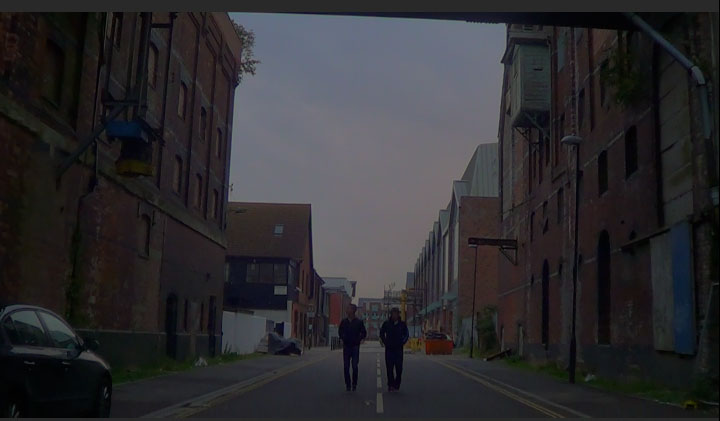
We have chosen to do the majority of filming at dusk as we do not want it to be too dark as otherwise we will not be seen on the camera and the shots will look unprofessional, we learnt this from our year 12 opening title sequence and our trailer recreation bridging task. Even if it's not dark enough at dusk we can use the colour corrector on our editing programmes that will make our trailer more effective.